Compagnia Nino Martoglio
Role
- Graphic Design
- Poster Design
- Advertising
- Direzione Creativa
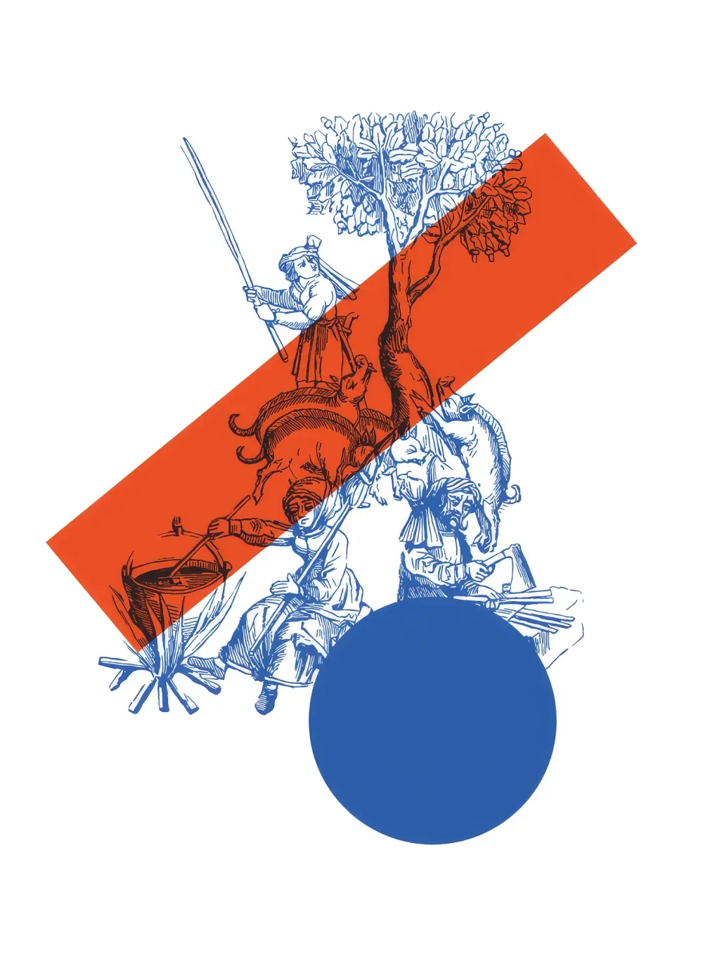
(INFO) The visual identity designed for Compagnia Teatrale Nino Martoglio emerges from a dialogue between memory and contemporary synthesis: the face of Nino Martoglio is transformed into an essential graphic sign, paired with the MN monogram inscribed within a circle, while illustrations, geometric shapes, typography, and color build a coherent and recognizable system capable of narrating the different theatre seasons while preserving continuity and character.
Concept
2017–2018 Season
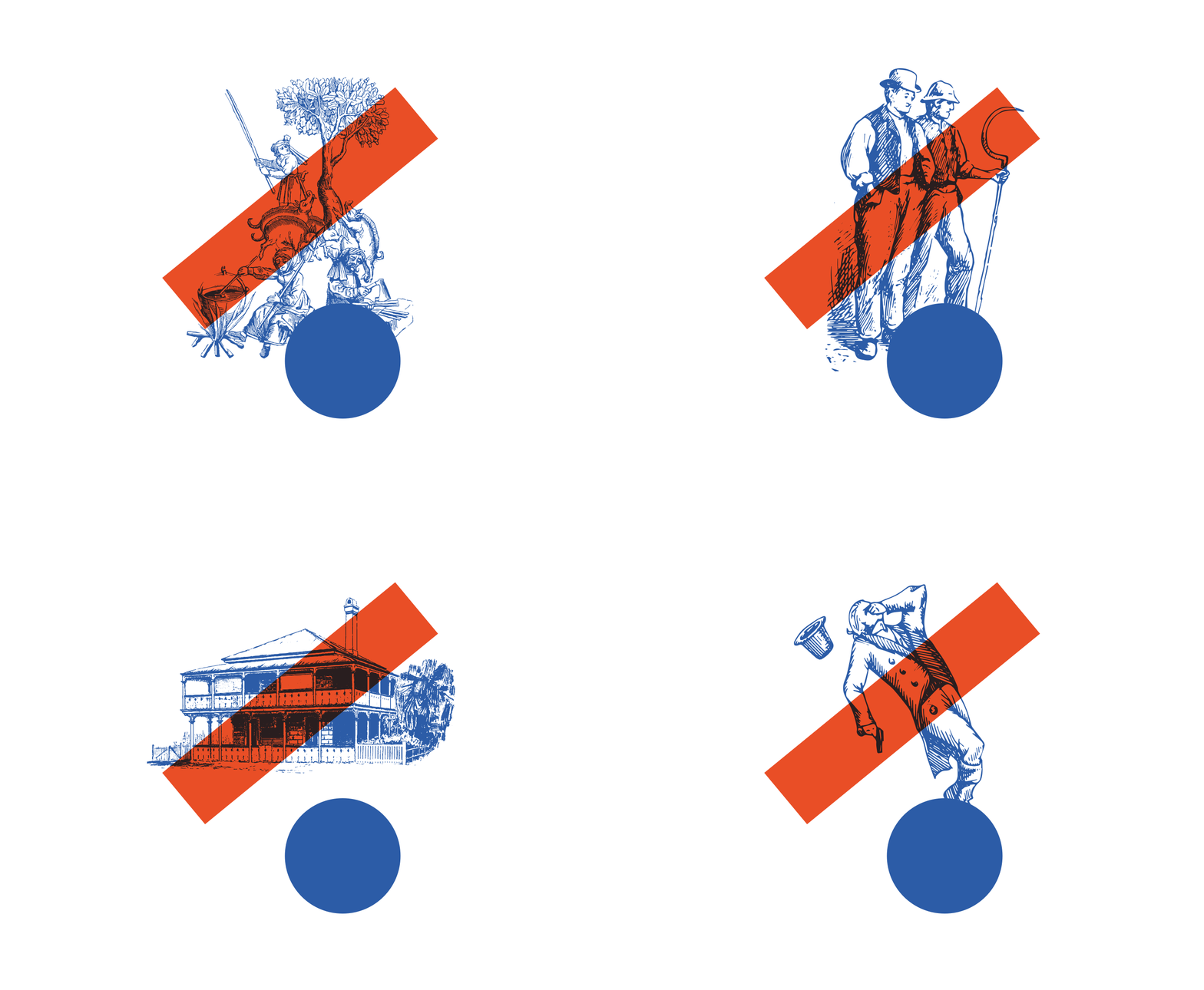
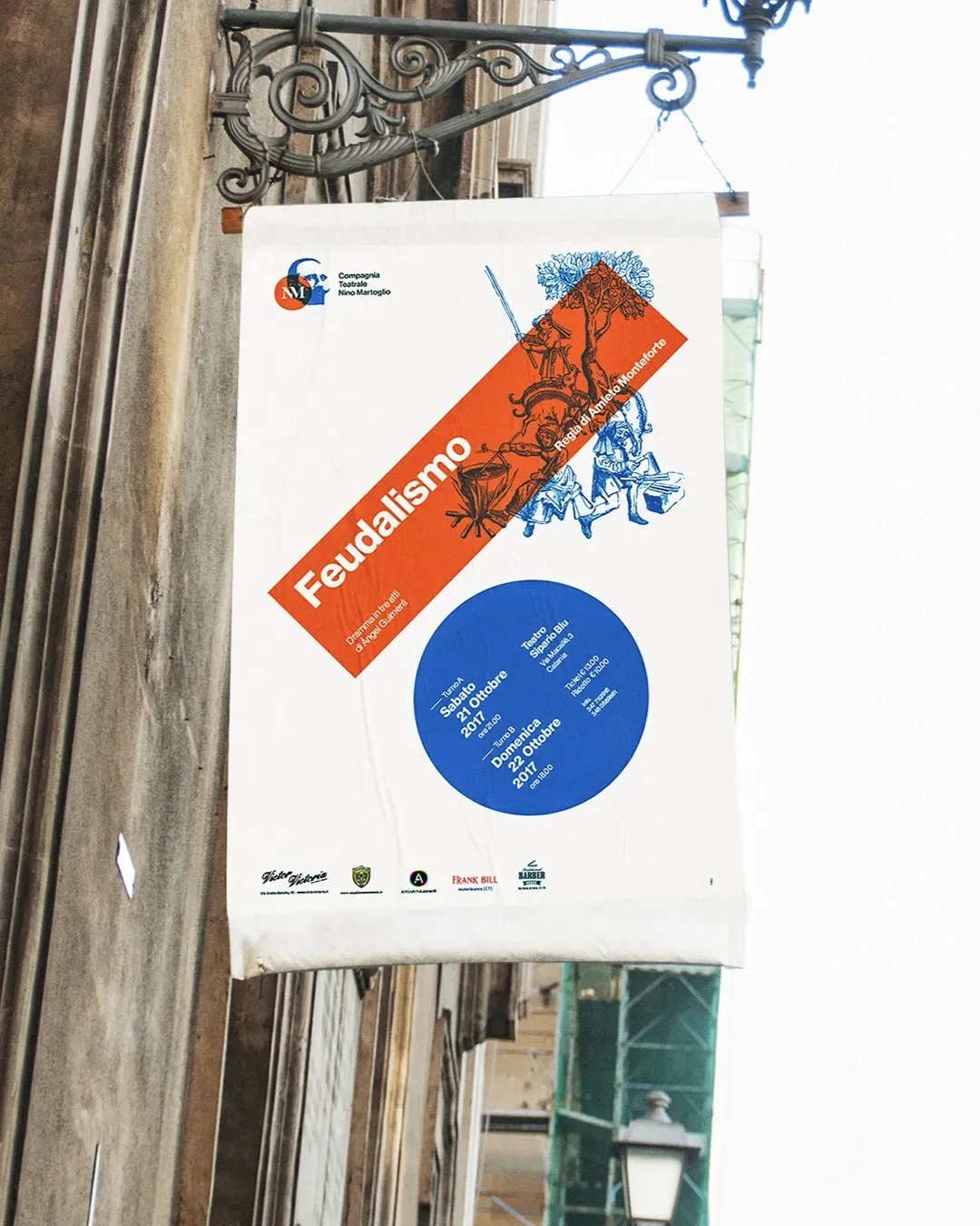
For the 2017–2018 season, we handled the restyling of the company’s visual identity and the graphic design of the entire seasonal communication. The new logo was developed through the reworking of Nino Martoglio’s face, vectorized and distilled into a distinctive visual sign, paired with the MN monogram placed inside a circle.
For the communication of the four productions in the season programme, we developed a visual language based on custom illustrations, designed to convey the atmosphere and character of each play. Onto these images, we overlaid a system of geometric shapes, especially circles and rectangles, used to organize information and create a clear, recognizable composition consistent with the brand identity.
Concept
2017–2018 Season
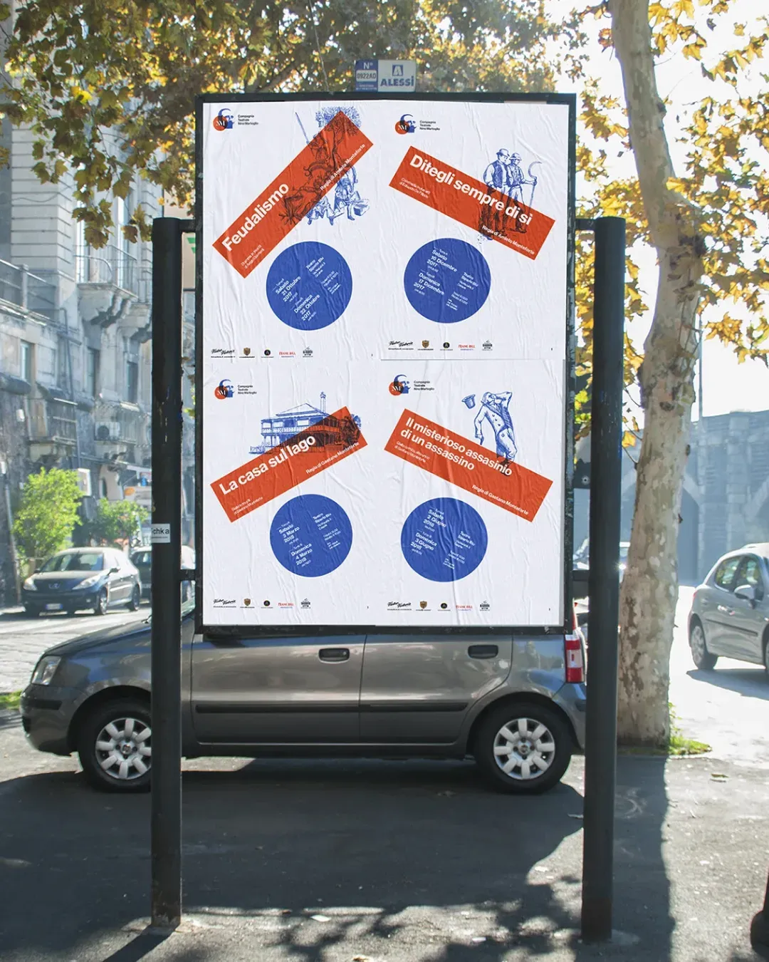
For the 2017–2018 season, we handled the restyling of the company’s visual identity and the graphic design of the entire seasonal communication. The new logo was developed through the reworking of Nino Martoglio’s face, vectorized and distilled into a distinctive visual sign, paired with the MN monogram placed inside a circle.
For the communication of the four productions in the season programme, we developed a visual language based on custom illustrations, designed to convey the atmosphere and character of each play. Onto these images, we overlaid a system of geometric shapes, especially circles and rectangles, used to organize information and create a clear, recognizable composition consistent with the brand identity.
Casa Comfort Arreda